Business cards and why mine is the best.
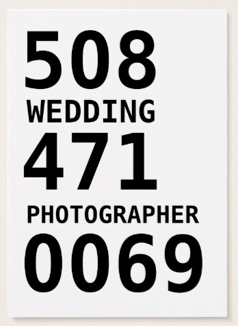
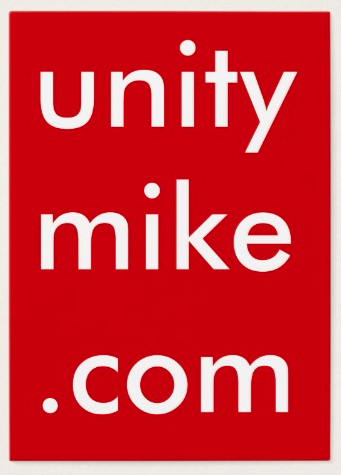
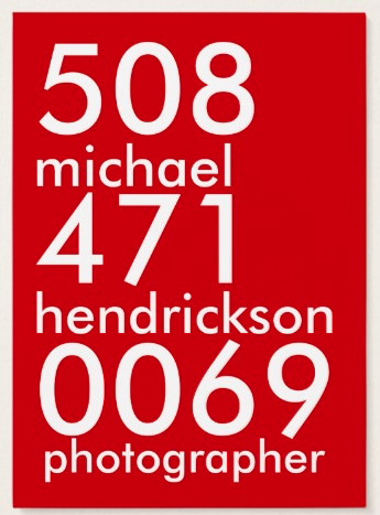
/Here's a few business cards i've put together. You can see the evolution of my design.
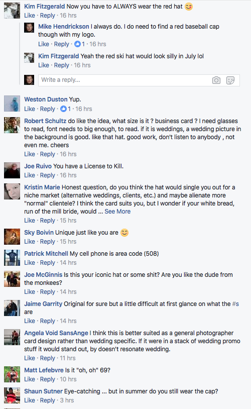
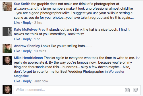
Brace yourself for a long winded rant about my business cards. You kinda asked for it... those were a lot of Facebook comments.
So Zazzle who I typically use for my business card had a little bit of a trimming mishap when producing my cards. They upgraded some of their behind the scenes editing software and it ended up pushing some of my text outside the cut lines. So this mishap meant they took care of me with credit and that allowed me to go back and readjust the cards. Additionally the thickness or weight of the card was so thick that during the cutting process the sheets shifted slightly. I had text very close to the edge and it showed any slight deviation. I only noticed it while dropping off a set of business cards.
I do want to preface this all with Zazzle is awesome. I've used other companies and I really have had good experiences with this company. The customer service is always top shelf. There has been times where I've made a mistake and other times where they've made a mistake. They have humans who work there and it turns out humans can make an occasional mistake, totally okay with that. I've had soo many people message with me various other companies that they use and I have to decline the help because I really do love this company and the fact that I have everything all ready and designed for print here. So with this current mishap Zazzle took care of me and just recently sent me an additional box of cards which was done unpressured and just a show of appreciation. So I ended up with double the amount of cards. I've been using Zazzle since I started my photography business and it's nice to have a steady supplier like them.
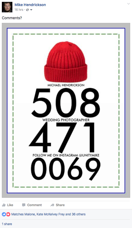
So I've put this out to my friends on Facebook, the designing of my card. I was mostly looking for feedback on my red hat that I want to include. I've spent a lot of time designing my card to stand apart from everyone else. Typically everyone does the same exact thing. Name, Phone, E-mail, logo and maybe a slogan. Think about how many business cards look exactly the same.
The design of my business card has been the same with minor adjustments over the past five years. One side is always a large image of my logo, large enough to read if it's on the ground or a table. I've chosen the chubby size cards instead of the standard for two reasons, it stands out and doesn't fit behind other cards nicely. The second reason is it's different, it's usually been a tear-proof material which is always an interesting challenge to my clients to tear it up.
So I appreciate everyones input for the cards. Some of the advice I totally understand. Use a beautiful image you've shot, use this font, why is the phone number so big. This is not a card which I've put together quickly. It's been made to stand out from the pack. A thousand cards will probably last me most of the year. Brides and grooms who typically end up with my card end up with it because they are in my office. Most people are finding me on Google, Facebook, Instagram or a random phone call. If these were being used for a wedding expo I would probably have something a bit different.
One of the biggest things with photographer is everyone happens to use a camera aperture for a logo (myself included, guilty). So I changed my logo a year or two back to something a littler bit more reflective of who and what. It now includes the words wedding which is my focus. I also have the dot come in the logo as well so now I don't have to do any additional dot come references elsewhere in the card. The main goal of my card is for it to stand apart from everyones no matter what business's card it's next to. My business name was believe it or not an AIM handle back in 1996 which was unity1818. Unity is an Operation Ivy song, not a Queen Latifah jam. It ended up as a placeholder for my website because I eventually needed one. Unity happens to work as a name for a business name but unity photography is actually taken by another photographer named Ken who I've actually met in real life. Anyways the reason I mention this is logos are hard and also very much essential to pull together a website, business card and any branding you may want to do. I didn't get to do anything cute like Two cranes photography or jumping cat photo. I based mine off a teenage Aol Instant Messenger name.
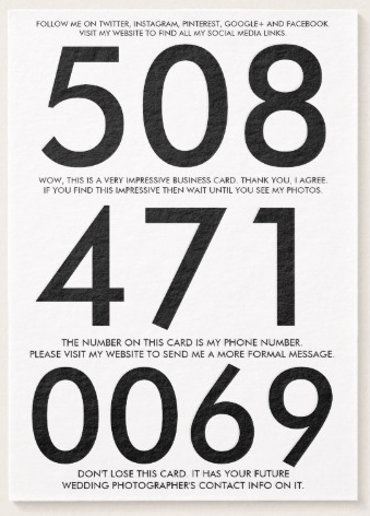
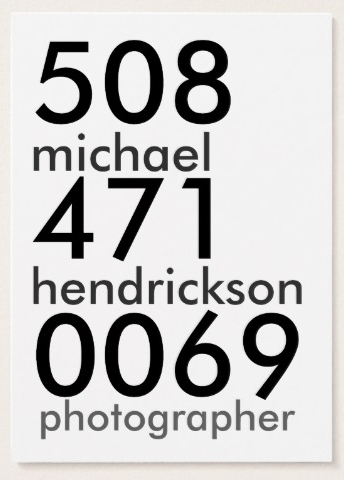
The giant phone number is something that takes people a second to grasp sometimes. I've had lots of people pick it up and say what is this and then it clicks. Then I have a few different sentences fit above, in-between and below the giant phone number. So whoever has already picked up my card because they don't understand the giant numbers at first and now they're reading all these sentences i've put on my card which is done is a very small font. So they've spent anywhere from fifteen seconds to twenty seconds reading this side of my business card. I just times myself doing it from picking it up and skimming through everything.
TEXT LISTED CURRENTLY ON MY BUSINESS CARD
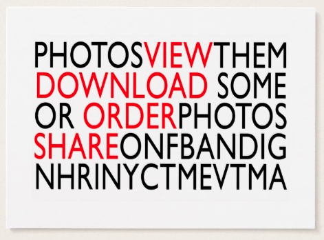
Follow me on Twitter, Instagram, Pinterest, Google+ and Facebook. Visit my website to find all my social media links.
Wow, this is a very impressive business card. Thank you, I agree. If you find this impressive then wait until you see my photos.
The number on this card is my phone number. Please visit my website to send me a more formal message.
Don't lose this card. Int has your future wedding photographer's contact info on it.
There is a rhyme to my reason.... is that even a saying?
So think about how long it takes for you to usually comprehend information on anyones business card. You look at a logo, an address maybe, hours possibly, phone and e-mail. I've already gotten almost twenty seconds of someones time. I've told them where they can find my social media links. I've directed them to my website to send me a message. I personally don't like a random e-mail from someone with a simple sentence "HOW MUCH" "WHAT ARE YOUR PACKAGES". So I love to direct people to my website where I have a proper contact form and more importantly all the information. I've also included a little bit of my humor by saying how impressive the business card is. If you didn't get what the numbers were or skipped over the numbers in favor for a full sentence then it's explained here with the above text. I've also told them how important the card is and not to lose it, it has your future wedding photographers info on it. Okay, that last sentence is a little cocky but it's cool, I know I rock.
So if you found this card and and saw all this information you would be able to get a quick snippet of who I am, personality wise possibly. As a wedding photographer i'm the person you'll have the most contact with during a wedding day. I'm literally with a bride all day long give or take some distance. The big thing I try to convey when I meet a bride and groom is the attitude of easy going. I'm very easy going, in fact most of my meetings i'm wearing that red hat and a hoodie. More meetings happen in the winter time. I'm also friending all of my brides and grooms on Facebook at some point. Since i'm spending the entire day with someone it totally benefits me to keep them in a good, relaxed and happy mood. Some of that comes from the informality of most of my approaches. I have brides contact me at eleven at night with a simple question or on Facebook on a Sunday afternoon. I'm very accessible and I make sure the bridal couple knows this. My goal is to have it feel like a friend is shooting your wedding.
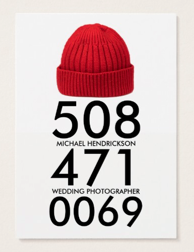
With my current design i've chosen to remove some of the text to focus more on branding myself with my favorite object, a red hat. Affectionally worn for the past six years solid or so. I'm regularly recognized everywhere for this hat. Currently it's a red winter hat from American Eagle but i've also had many other variations of this red hat. I can't really wear baseball caps when I shoot outdoors and fedoras or these winter caps have always hung around me. I've actually gotten to meet a lot of my Facebook friends in public because they spot me somewhere in Worcester, Boston, NYC. It's a very bold color and my attire doesn't really have to match the hat. What i'm doing by including the red hat with my business cards are training anyone who ends up with this card to eventually be able to spot that exact red hat. Think about it. You have this random card with a red hat, phone, name, wedding photographer and you see a random photographer with the same exact hat. Chances are you are going to come up and say hi and tell me about how you ended up with the card.
I'm going to meander a bit, follow along.
So beyond wedding photography I actually do a number of things. One of those things being web design. When I meet someone who asks for photos or video the first thing I ask is what it's being used for. They tell me they want to put it on their website or Facebook. The next question I ask is to see their website and from there I see their website is angelfire or geocities hosted (antiquated reference, totally worth googling). So from there I talk to them about web design in addition to photos. So I can put togethers someone website pretty easily with a few photos and rearranging information. Here's the other thing I do, consulting work.
What is consulting work as it applies to you? Okay, thats a question being asked to me if that didn't make sense there. What I do is interview a business owner and pull out content to add to their website. Often times while explaining things it leads to other questions which inadvenrtuly conclude with a change in their own business's infrastructure. One of the best questions you can ask someone is "What would this look like if it were easy". It's a question you can ask any business owner. It helps them identify a problem area and provide the easiest solution and then we can work on the actual route to getting there. I also will call out an weak areas in their dealings and suggestions I may have to changing routine.
So I deal with many different businesses and these owners all happen to be around Worcester and Boston and every once and awhile I get recognized in a Starbucks or while on the job shooting somewhere. I'm training everyone as well as brides, grooms to recognize and associate the red hat with Michael Hendrickson, wedding photographer.
I have time.
So hopefully everyone will understand my reasoning a little bit better now. It's not simply a harsh design choice. I've slowly evolved it from the very simple to the more complex. My goal with my cards are to stand apart from everyone and I fear being similar to everyone else will make me blend a little too much. I've spent a few minutes to design some of what everyone's asked for in a business card just to appease some.
I've made a few quick mock-ups of what some think would make a good business card. I've also reverted the size back to a standard business card size. This is not a dig on anyone. This is suggestions i've gotten on the initial thread on Facebook as well as in private messages.
Okay. So here's my final design. I did put some thought into this. If you've read this entire blog then hopefully you've fell on my side of the wall.
